How Color Shapes Perception in Retail Marketing
Color is one of the first signals people process when they encounter a brand, product page, email, or physical store. Before a customer reads a description, recognizes a fabric, or studies a silhouette, color has already influenced their expectations. It can suggest warmth, restraint, energy, heritage, practicality, or luxury within a fraction of a second.
For a retailer such as Focarth, color is especially meaningful because the assortment is built around enduring clothing, footwear, accessories, and considered home goods. A quiet palette can reinforce quality and versatility, while a carefully placed accent can draw attention to a new arrival, a seasonal story, or a distinctive material.
The psychology of color in marketing is not a rigid system in which every shade produces the same reaction. Meaning depends on context, culture, saturation, contrast, product category, photography, and the customer’s previous experience. Effective color strategy connects emotional associations with a clear brand identity and a useful shopping experience.
Why color influences buying decisions
Human vision is highly responsive to contrast and visual grouping. Color helps people identify what deserves attention, distinguish one product from another, and understand how a page is organized. In an online shop, a colored button, image background, or promotional label can guide the eye before a customer consciously decides where to look.
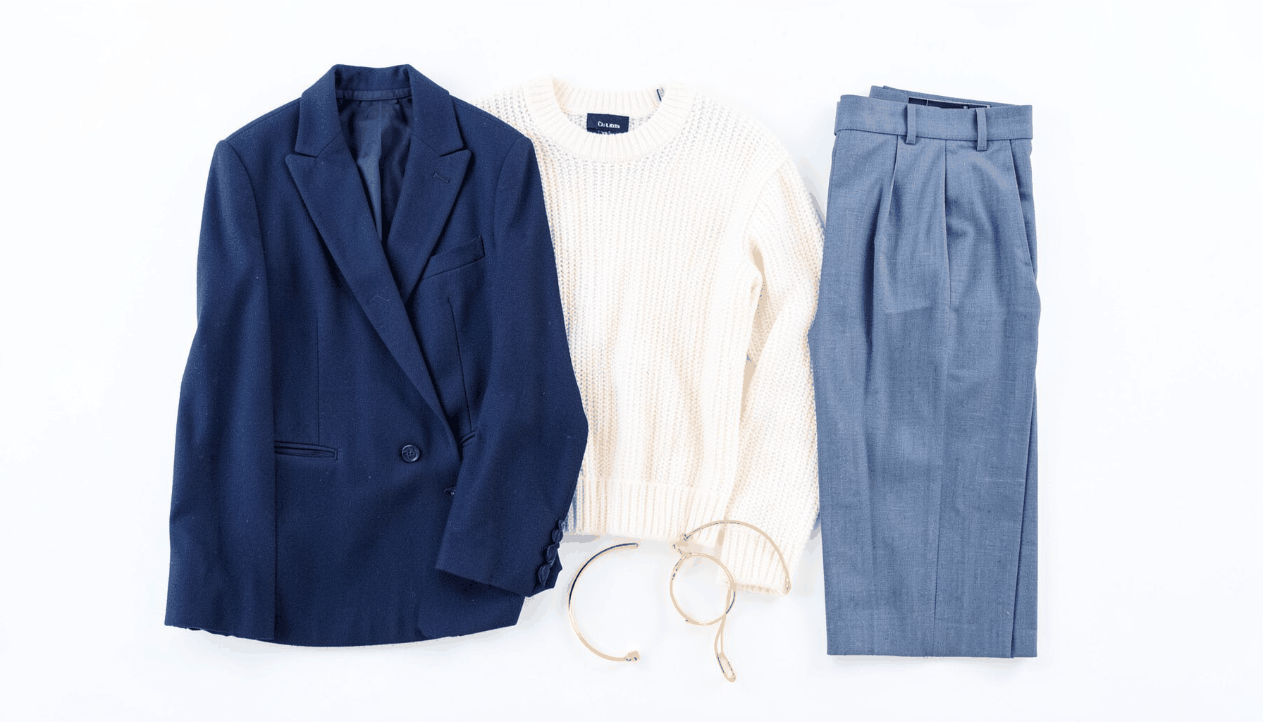
Emotional associations also shape interpretation. Deep navy may feel dependable and established, while olive can suggest utility, nature, or military heritage. Warm rust may communicate craft and autumnal comfort. These impressions are not universal laws, yet they provide a visual vocabulary that marketers can use when it supports the product’s character.
Color can also influence perceived value. Muted, complex tones often appear refined when paired with generous spacing, clear typography, and detailed photography. Bright colors can feel energetic and accessible, but they may become distracting if every element competes for attention. The surrounding design determines whether a color feels premium, playful, functional, or inexpensive.
Brand identity begins with a visual point of view
A brand palette should express what a retailer consistently stands for. Focarth’s emphasis on heritage labels, durable materials, timeless design, and practical daily use lends itself to grounded colors such as charcoal, ecru, forest green, navy, tobacco, and stone. These hues can create continuity across categories without making every page look identical.
The purpose is not to limit the assortment to neutral products. A restrained interface can give brighter garments, patterned textiles, or unusual accessories room to stand out. Likewise, a warm accent color can highlight a particular collection without overwhelming the broader visual identity. The palette should frame the products rather than compete with them.
Consistency builds recognition. When the same core colors appear across the website, packaging, email campaigns, social content, and editorial photography, customers begin to associate those visual cues with the brand. This recognition is particularly valuable for a curated retailer, where trust depends on a coherent point of view rather than constant novelty.
Color meanings change with context
The same shade can communicate different ideas depending on where and how it appears. Red may signal urgency in a sale banner, warmth in a knitwear campaign, or heritage when used in a traditional pattern. Green can evoke sustainability, but it may also suggest outdoor utility, freshness, or a military influence. Black may represent elegance, authority, simplicity, or technical performance.
Cultural expectations matter as well. Color symbolism varies across countries, age groups, industries, and communities. A palette that feels understated in one market may seem dull in another, while a shade associated with celebration in one culture can carry a very different meaning elsewhere. International retail communication benefits from research rather than assumptions.
Product context is equally important. A pale blue background may make a lightweight shirt feel fresh and summery, but it could weaken the impression of a rugged boot. An earthy backdrop may help a wool blanket feel tactile and grounded, while too much brown could make an online interface appear heavy. Color should reinforce the story customers need to understand.
| Color family |
Common associations |
Useful retail applications |
Potential risk |
| Navy and blue |
Trust, reliability, calm, competence |
Heritage clothing, essentials, navigation, service messaging |
Can feel impersonal or overly corporate |
| Green and olive |
Nature, utility, renewal, outdoor life |
Field jackets, sustainable materials, lifestyle imagery |
Sustainability claims may appear superficial |
| Brown and tobacco |
Craft, warmth, leather, tradition |
Boots, accessories, knitwear, autumn campaigns |
Can become visually heavy without light contrast |
| Red and rust |
Energy, warmth, urgency, appetite |
Promotional accents, seasonal stories, statement products |
Excessive use can create pressure or visual noise |
| Yellow and ochre |
Optimism, light, friendliness, attention |
Small highlights, summer collections, editorial details |
Low contrast can harm readability |
| Black and charcoal |
Authority, sophistication, simplicity |
Luxury presentation, typography, footwear, navigation |
May feel severe or reduce product detail |
| White, cream, and ecru |
Space, purity, calm, versatility |
Product backgrounds, minimal layouts, home goods |
Poor contrast can make interfaces inaccessible |
Product photography carries emotional meaning
In ecommerce, color psychology extends beyond the interface palette. Photography determines how customers experience the product’s color, texture, scale, and setting. A navy jacket photographed against a cool gray wall may appear technical and urban; the same jacket against weathered wood and soft daylight may feel more connected to countryside heritage.
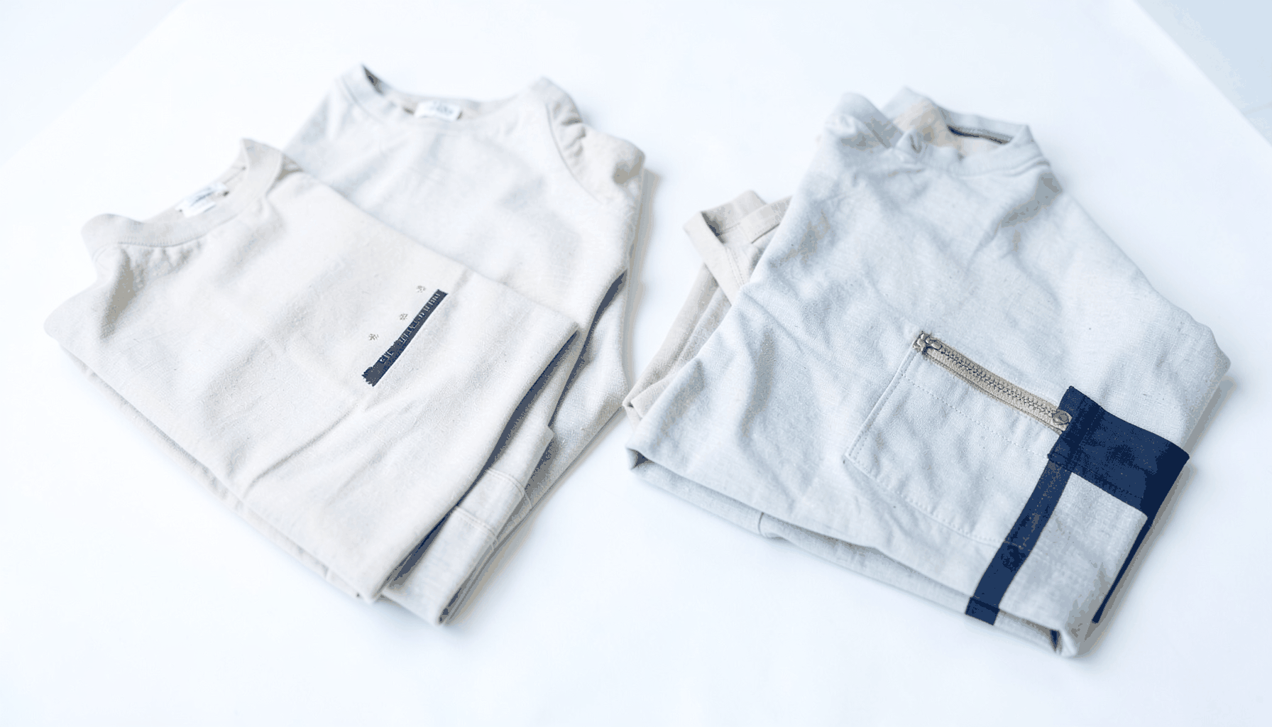
Background color affects accuracy as well as mood. Strongly tinted backdrops can alter how shoppers perceive garment colors, which may lead to disappointment when the item arrives. Neutral or gently contextual backgrounds often provide a better balance between atmosphere and faithful representation. Close-up images are useful for showing weave, grain, nap, stitching, and other details that add credibility.
Lighting should be considered as part of the color strategy. Warm light can make beige, camel, and brown appear richer, while cool light can emphasize blue and gray. Neither approach is automatically correct, but consistency across product photography makes the assortment easier to compare. Customers should be able to judge whether two items coordinate without compensating for different visual treatments.
For Focarth, editorial imagery can connect fashion with intentional living. A textured knit, practical shoe, or compact home object can be placed in a calm setting using natural materials and a controlled palette. This approach turns color into part of a lifestyle narrative while keeping the product central.
Designing a calmer shopping journey
Color can organize an online store without making it feel busy. A mostly neutral interface allows product photography to lead, while a single accent color can identify links, filters, selected sizes, and calls to action. When the same accent performs the same function throughout the site, customers learn its meaning quickly.
Hierarchy is essential. A “new arrival” marker may use a warm tone, while a restock notice could use a cooler, reassuring shade. Men’s and women’s rankings can be differentiated through labels, typography, or subtle background tones rather than unrelated color systems. The goal is clarity, not decoration.
Accessibility must guide every decision. Text needs sufficient contrast against its background, and color should never be the only way to communicate availability, category, size, or status. A green dot and a red dot may be indistinguishable to some users, so labels, icons, or patterns should carry the same information. Accessible design also improves usability for shoppers viewing a screen in bright light or at reduced brightness.
Practical ways to apply color with intention
- Choose a compact core palette that reflects the retailer’s materials, product categories, and tone of voice.
- Use one or two accent shades to direct attention toward navigation, editorial features, and meaningful actions.
- Photograph products with consistent lighting and backgrounds so color remains trustworthy across listings.
- Test contrast, text legibility, and color-blind accessibility on mobile and desktop screens.
- Compare color variations through controlled experiments while measuring engagement, product discovery, and completed purchases.
Seasonal color can create relevance without chasing trends
Seasonal marketing often relies on color because it offers a fast way to signal time and atmosphere. Moss, rust, and tobacco can support an autumn story, while washed blue, chalk, and soft green may suggest spring. These references can make a collection feel timely without requiring a complete change in brand identity.
The strongest seasonal palettes usually extend the existing visual language. A retailer rooted in understated design might introduce one seasonal accent rather than replace its entire interface with bright colors. This preserves recognition and gives customers a sense of continuity. It also keeps campaigns useful after the season has passed.
Color can connect different categories into a single editorial theme. A Pendleton textile, a Barbour outer layer, Tricker’s footwear, and a warm-toned home accessory may belong to different departments, yet a shared palette can show how they relate within a considered wardrobe or living space. This supports cross-category discovery without forcing an artificial lifestyle narrative.
Seasonality should also account for accessibility and photography. Dark winter campaigns need enough tonal variation to prevent charcoal products disappearing into black backgrounds. Light summer layouts need readable typography and clear boundaries around interactive elements. A beautiful palette that makes products difficult to inspect is a poor commercial choice.
Measure response without reducing color to a formula
Customer behavior can reveal whether a palette is helping or hindering the shopping experience. Useful signals include product-card interaction, filter usage, time spent on editorial pages, email click-through rates, add-to-cart activity, and completed purchases. These measures should be interpreted alongside qualitative feedback and customer service observations.
A/B testing can compare an accent color, promotional banner, button treatment, or photography background. Tests should isolate one meaningful variable where possible. If the background, headline, offer, and layout all change at once, it becomes difficult to identify what influenced the result. Short-term clicks also need context, since a louder color may generate attention without producing qualified purchases.
The best-performing option is not always the brightest or most emotionally intense. A calm design may lead to stronger product engagement because it reduces distraction. A subdued button may outperform a vivid one when it fits the brand and appears in a clear position. Color should be evaluated as part of the complete customer journey, from first impression through product confidence and checkout.
Over time, patterns can reveal which visual cues suit different categories. Footwear may benefit from dark, tactile settings that emphasize construction, while knitwear may perform well with warm neutrals and close-up texture. Home goods may need more spacious compositions to communicate scale and usefulness. Data helps refine the system while brand judgment keeps it coherent.
A durable palette supports long-term recognition
Retailers with a curated assortment benefit from visual restraint because restraint gives meaning to variation. When the surrounding design is stable, changes in fabric, silhouette, pattern, and seasonal color become easier to notice. Customers can explore new arrivals and restocks without feeling that the entire shopping environment has been redesigned.
This is especially relevant for heritage brands. Their appeal often comes from continuity, material knowledge, and recognizable details rather than constant visual disruption. A color system built around natural, adaptable tones can respect that character while still feeling current. It also works well across digital merchandising, printed materials, packaging, and smaller living spaces.
Color becomes most persuasive when it agrees with every other brand signal. A refined palette cannot compensate for confusing navigation, inaccurate product images, or vague descriptions. When visual design, product quality, editorial voice, and service standards all communicate the same values, color strengthens the message quietly and effectively.
Use color to make the assortment easier to understand, the brand easier to remember, and the path to purchase more comfortable. Explore Focarth’s clothing, footwear, accessories, and home selections to see how enduring materials and understated design can work together in everyday life.